
Instruction: highlight the link, then right-click to go to the YouTube video


Seascape step-by-step:
The sea is painted first; otherwise, you have to wait for the sky to dry. Use a warm blue (ultramarine) of milk tea consistency and leave a few horizontal marks unpainted, which represent distant waves. Leave a white space below the blue, which represents the top of the big wave.
Next, have two brushes prepared, one LOADED with warm yellow (raw sienna or yellow ochre) of milk tea consistency, the other with a pale cool blue (cerulean blue) of herbal tea consistency. Paint the beach with the two colours next to each other without overmixing them, or they will turn green just in part, like here!
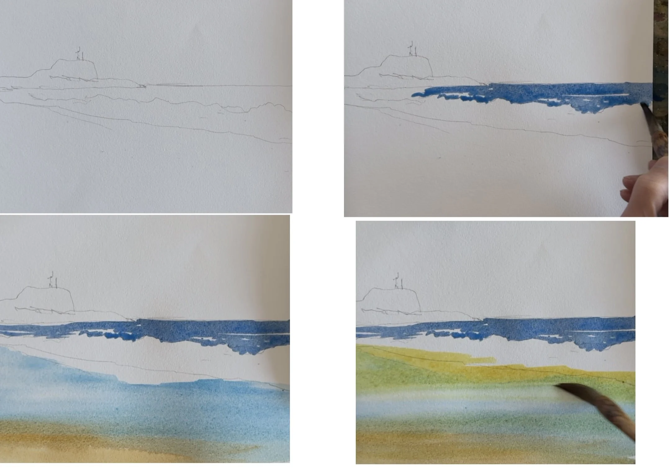


I then paint the shadow of the wave with a herbal tea light grey from right to left so that it gets lighter and smaller at the far end. Try to paint it in one go, pushing the tip of the brush from right to left without dabbing. Plan ahead and don’t try to correct any mistakes. Oftentimes, the result is better than fussing over it.
Paint the cool blue sky with big brush strokes in under 30 seconds without fussing. If you like, you can add some raw sienna and lavender below the cool blue to suggest cloud shadows.
While the beach is still moist, paint the reflection of the headland loosely. Use the same brush to add a few horizontal lines.
The headland (make it greener if you like) and lighthouse are painted wet on dry. Line them up with the reflection fairly closely.
Paint a strip of grey shadow where the white water meets the sand.
Then, add the figure, dog, and seagulls. Their reflections are created by using a dry finger to smudge a dot of dark paint vertically down.
Finally, pick up a bit of white gouache directly from the tube with a moist nylon fan brush or toothbrush and splatter it above the big wave. Paint a few horizontal lines on the reflections and under the feet of the figure, dog and seagulls.
NB.
It is not necessary to follow all these steps to the latter. Try to be creative and follow your instinct.
If you want to paint a simpler version, just omit all the reflections.
It is not expected, as a beginner, to achieve this on the first attempt. Expect to make many mistakes. The more mistakes you make, the better!
Another ‘secret’ in watercolour is to use 300gsm 100% cotton paper such as the cheapish Baohong brand, Academy (‘student’) grade or the more expensive Artist (professional) grade from Amazon. You can also buy Artist grade from Parker’s Art Supplies in Sydney. Woodpulp papers are not beginner-friendly. Pure cotton is best.
The above painting was primarily painted with K-Mart pigment. The white gouache is brought separately for about $10 a tube, which lasts me over a year.
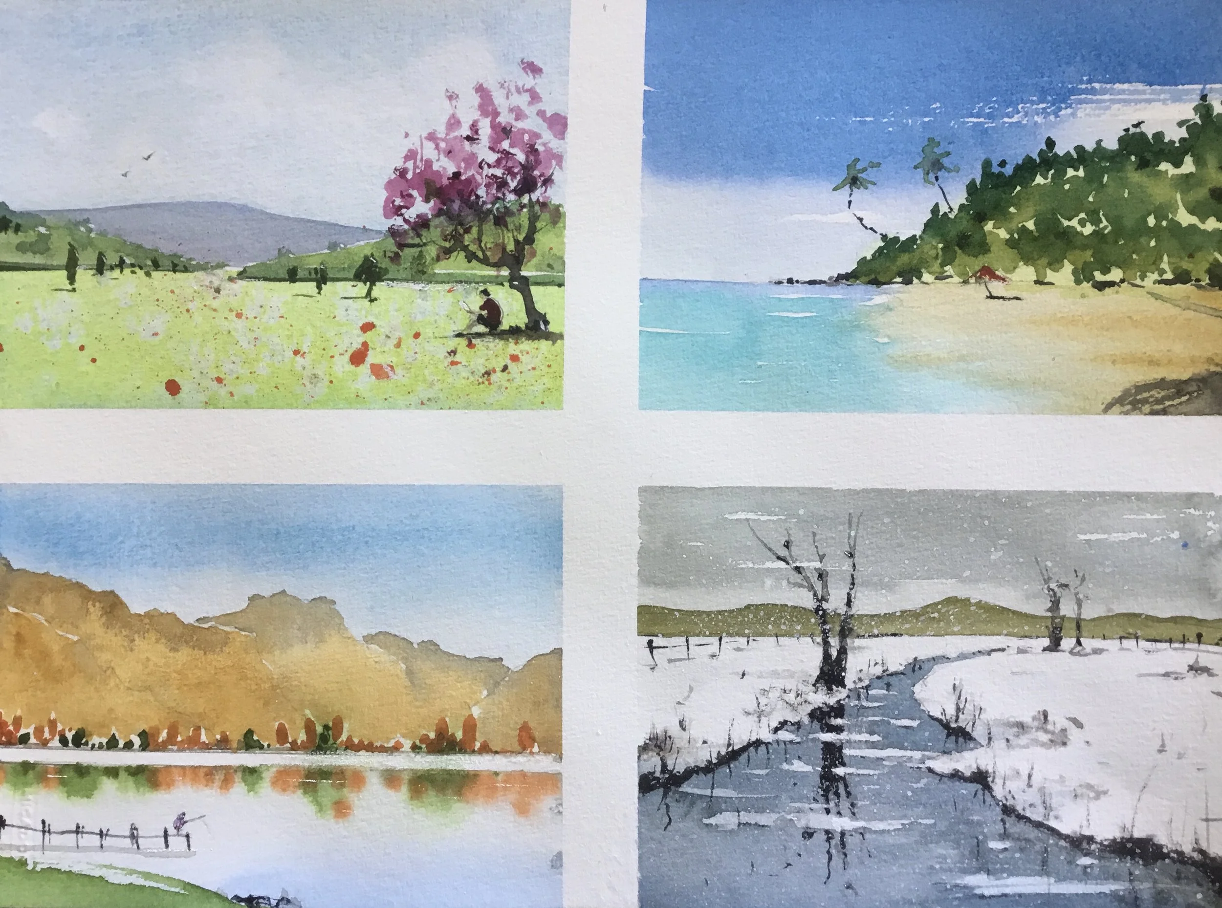
The Four Seasons explained in technical terms - 18 Sept 2025
For the final lesson of the beginners’ course, I fitted these four tiny studies onto an A4 100% cotton paper as a revision of what we had done in the previous seven weeks.
Very few instructions were provided during the class on purpose. Pleasingly, students were good enough to apply the various techniques they had learnt. Here are the techniques I used. But please experiment with other techniques if you wish.
Spring:
I used cerulean blue flat wash for the sky. When about 30% dry, I used tissue paper to lift the blue for the clouds. When about 80% dry, I painted the distant hill with a cool violet blue green to impart a slightly soft, fuzzy edge. The mid-distant hill and foreground hill are warmer/greener with small trees. The lawn was made even warmer and greener by adding lemon yellow. When still wet, I added salt (or water globules), which afforded pale spots when dry. When the sky and hill were totally dry, I sponged on magenta for the tree. Added trunk, shadow and figure. Splattered red with a nylon fan brush (or toothbrush), larger in front and smaller at the back for perspective.
Summer:
Cobalt sky with a patch of white produced with a dry brush. I rinsed the blue off the brush and used only water to connect the blue to the horizon (a graded wash of one colour). Next was a herbal tea wash with raw Sienna on the right. On the left, a bit of cobalt blue is mingled on the paper with the turquoise below (a variegated wash of two or more colours). This blue wash and raw Sienna merge with a soft edge. When the yellow was still moist, two horizontal strips of burnt sienna were added for texture. For the hill, when dry, a layer of milked tea green was added, but allowed some yellow to show through (negative painting). A darker green was added wet in wet to the top edge. Dry brush in the rock at the lower right corner.
Autumn:
I first painted the reflection by wetting the lower third of the paper. I applied dots of orange/yellow and green colours, and since the board is at about 30 degrees, gravity will paint the rest. (We should always paint with the board at 10 to 30 degrees). The trees above were painted wet in dry. When dry, paint a herbal tea layer with yellow around the trees, leaving some white as highlights. When dry, I added a layer of milk tea yellow, and dropped some milk coffee yellow here and there. Whilst wet/moist, I added a tiny bit of grey on the hilltops, and gravity will pull it downwards as it did for the tree reflection.
Winter:
A cool grey sky, leaving some white strips (optional). A cool blue-grey river leaving some white strips (mandatory). A dead tree, its reflection cleared of the floating snow. There’s no need to be too precise. Any inaccuracy can be covered with a dot of white gouache. Add a bit of dark below the ice. Blades of long grass have their reflections, too. Don’t forget the shadow under the fence post. Finally, splatter white gouache for falling snow.

The third layer was achieved by adding more cobalt blue with indigo (or ultramarine) to produce a darker green. It is essential to leave the roofs white (negative painting). Also, the tops of bushes are left unpainted, which retains the light first wash.
A couple of darker trees with more indigo on either side, using side brush.

With the big shapes painted, I then added some jewellery, such as tree branches, grass, a jetty, and a bridge with matching reflections. I splattered yellow gouache, scarlet red and lavender..
The roof was painted in a single stroke with a dry side brush using burnt sienna.
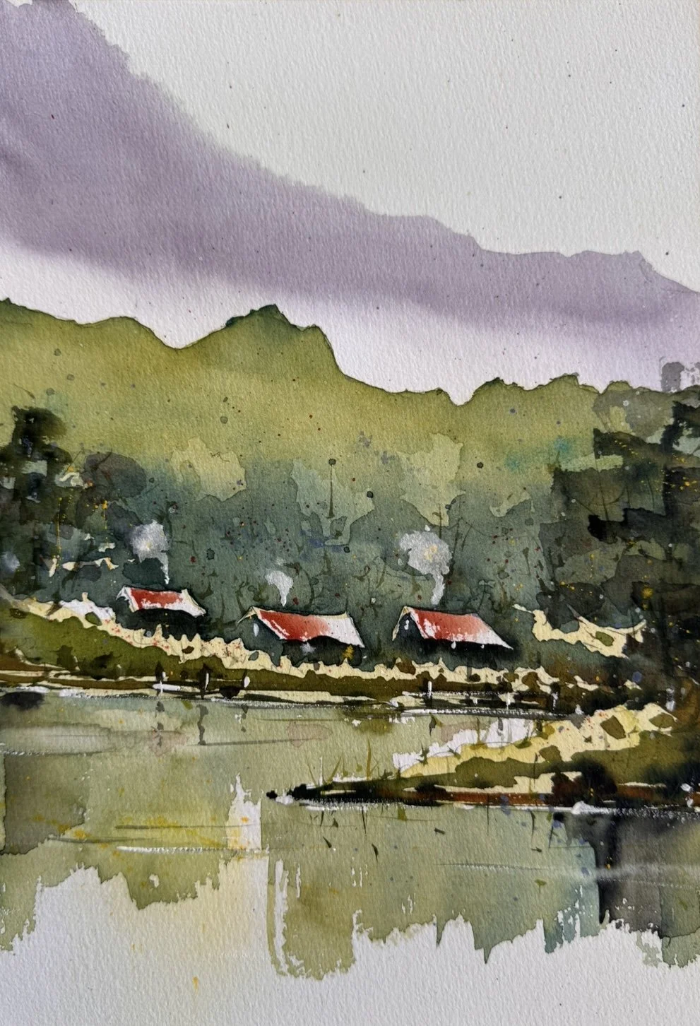

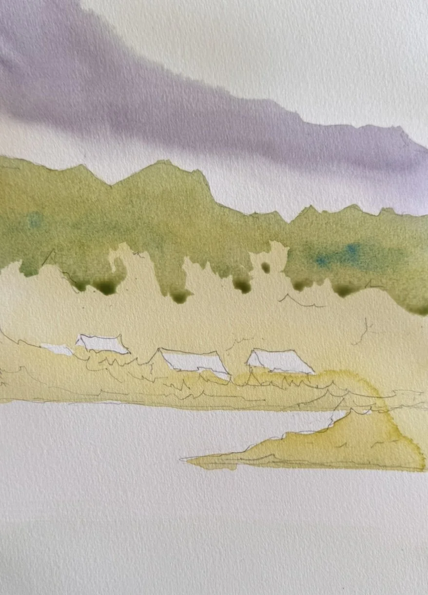
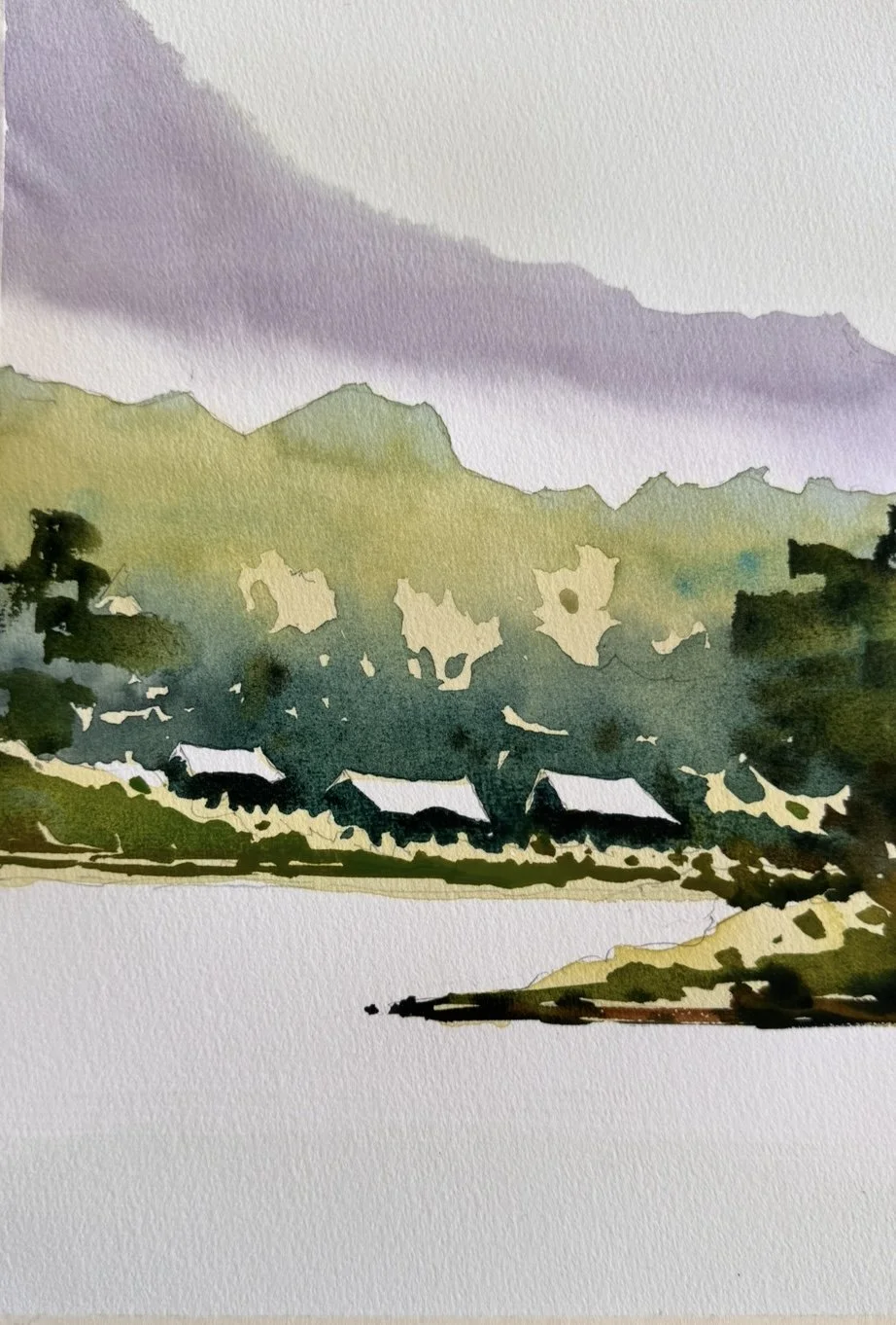
THE FOUR SEASONS
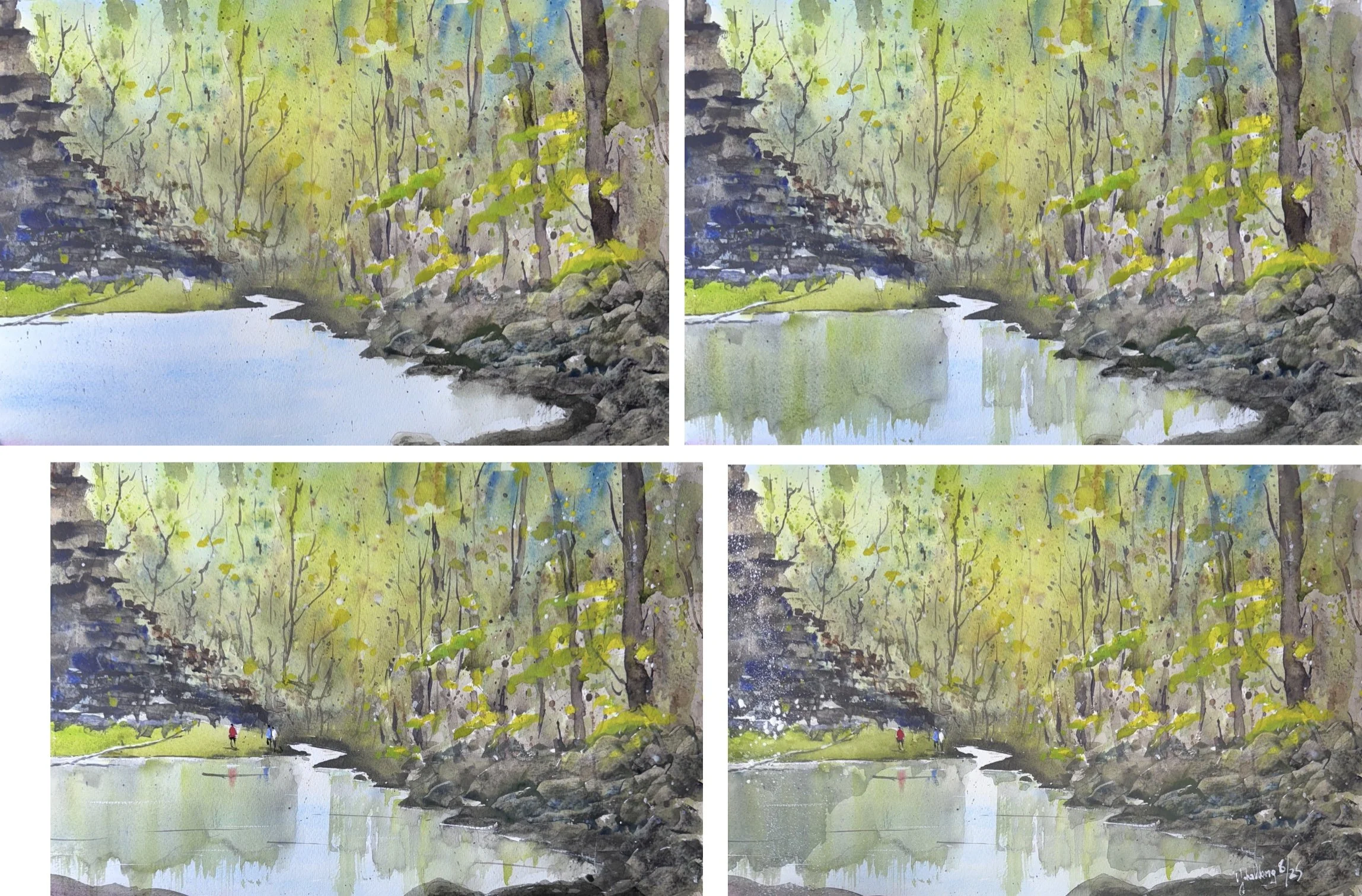
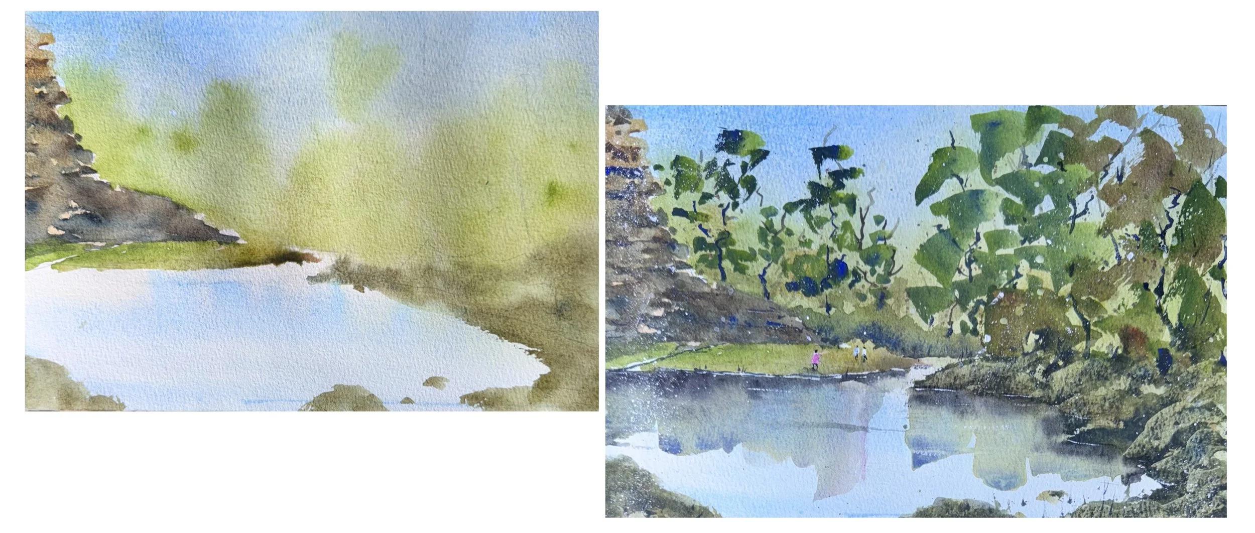
LOOSE ATMOSPHERIC LANDSCAPE - 23 Sept 2025
This exercise involves mixing my own greens - a versatile neutral (neither warm nor cool) green by using cobalt blue and mid-yellow. To mix a dark green, I added Indigo to the above mix.
Drawing: I avoided using a pencil to outline the distant mountain as it would show through the light wash.
I drew the houses with sagging roofs with some bushes in front.
It is essential to set the paper at an angle of 10-30 degrees.
I painted the sky with some dirty water - an extremely diluted grey.
When moist, the mountain was painted with a weak mix of burnt umber, indigo, and a touch of arizarin crimson to produce a purplish grey. The soft edge was created wet on moist, while the hard edge was created wet on dry. I washed the brush thoroughly and used clean water to produce the mist.
The first layer of green was of herbal tea consistency, achieved by mixing cobalt blue and a mid-yellow (darker than lemon yellow).
When dry, I painted the second green layer of milk tea consistency, thickened by adding more cobalt blue. I added a touch of light cerulean blue here and there for texture (a variegated wash).
Reflection was painted with a side brush. The brush is held horizontally with my palm facing up, like holding a spoon. The whole brush was loaded with pigment, not just at the tip. The brush was pulled down the paper with the whole brush touching the paper, flexing only the elbow and shoulder joints.
A bit of darker colours was added here and there at the shoreline, and gravity will guide it down the paper. A moist brush was used to lift some colours, suggesting ripples. Alternatively, wait until the reflection is completely dry, then use a small wet brush and tissue to lift the dried paint.
You can also use this lifting technique to lighten any area of the painting.
Conversely, you can glaze over areas that are too light. For example, I didn’t like the three pale herbal tea ‘holes’, so I darkened the whole hill with a herbal green glaze gently without disturbing the paint underneath.

Finally, white gouache was used on the posts and bridge, shore lines and water for highlights.
One-point perspective example - street - YouTube link: https://youtu.be/a8JBEK0mo6U
(Note: for optimal playback speed, set it to 0.75)
Main point: “Every line leads to the vanishing point”.
Painting people - standing and walking - YouTube link:
https://youtu.be/COW_vfInc2U
Main Point: Every eye is on “eye line”.
Painting people - sitting - YouTube link:
https://youtu.be/o5bCLa81uwY
Main Point: Every eye is on “eye line”.
Painting people - beach cafe in perspective - YouTube link:
https://youtu.be/xIZ4TxNOWHc
Main Points: People at the near and far tables share the same Eye Line, except that the further they are, the smaller they are. Parasols and furniture also follow invisible perspective lines.
The clouds are produced with a bit of raw sienna and white. Cloud edges are softened with a moist brush here and there.
Foreground texture produced by small globules of water from an old Ajex spray bottle.
Distant headland is slightly cooler with a blue tint.
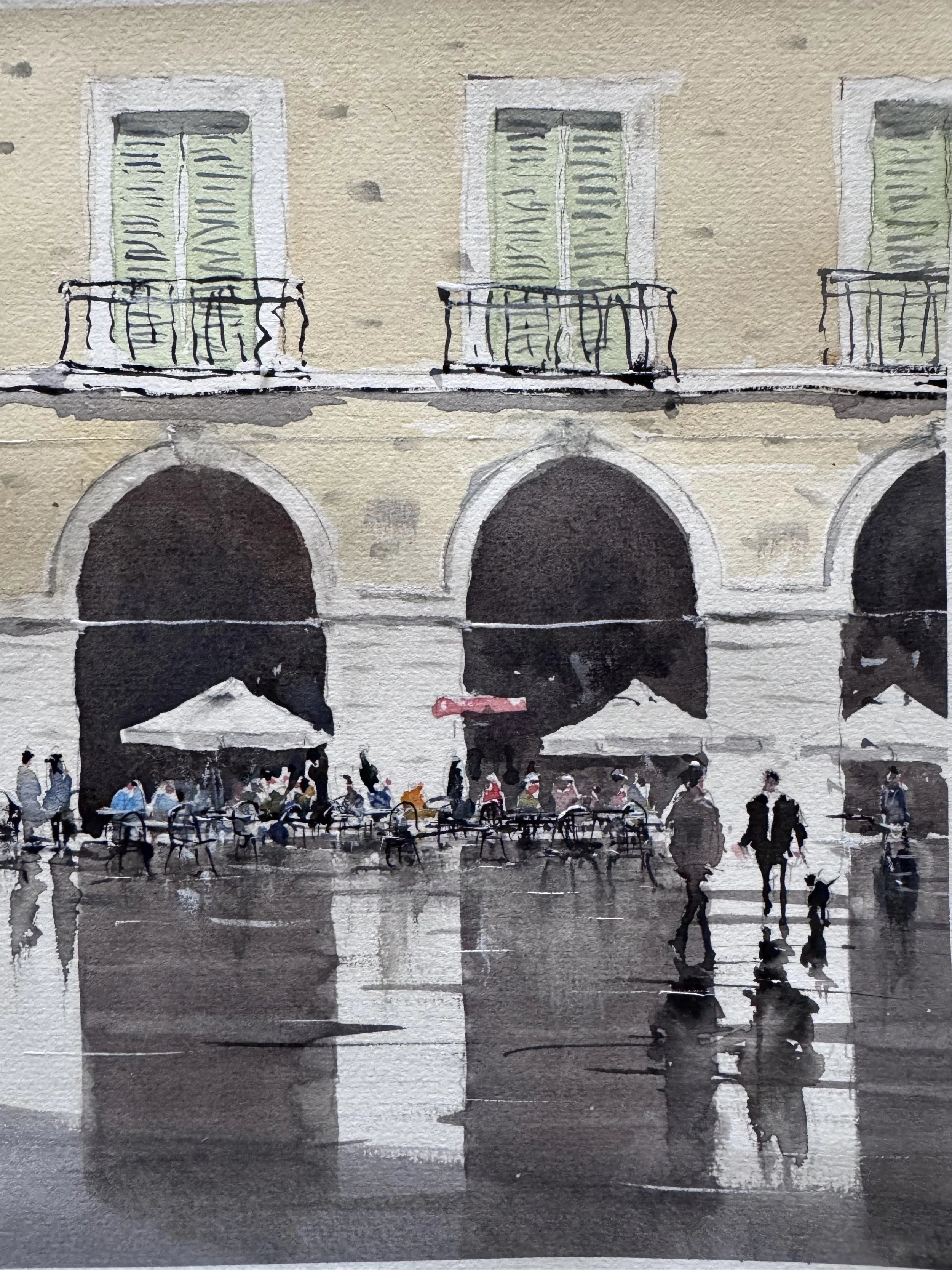
Painting a rainy scene - Rome cafe with reflection - YouTube link:
Part 1 - https://youtu.be/Zs_1gP8OdtI
Part 2 - https://youtu.be/k5B7ioCiLoY
Main points: the viewer’s attention is invariably drawn to an area with maximal contrast - the lightest light contrasts with the darkest dark.
The lightest is the untouched paper; the darkest is a thick mix of burnt umbra and ultramarine. While the paint is still wet, drag the thin edge of a moist, flat brush across to lift paint from the dark area and deposit it on the light area. You can also supplement with a bit of white gouache here and there.
Correct perspectives: pay attention to the eye levels of people who are sitting and standing, although it is better not to be 100%.

Below is a scene in The Blue Mountains. On the left is a partial view of a waterfall.
Version 1: 41 X 31 cm
Wet on Dry: Allow colours to mingle on the paper. Flick dark on moist paint, and more after it has dried.
Gaps of white paper left for warmer green later.
The focal point is darkened to allow maximum contrast with the white.
More splattering, wet on dry. Spray and allow colours to mingle while running down the paper inclined at 20 degrees.
Rock with raw Sienna, raw umber and ultramarine. Then add textures with wet-on-moist/dry techniques using burnt umber, ultramarine, and turquoise.
Paint tree trunks with gaps.
Rocks fashioned with a plastic card.
Fill gaps with warmer green. Reflection using the side of a Chinese calligraphy brush.
Spray white gouache with a nylon fan brush to suggest water droplets from the waterfall.
Version 2: 26 X 18 cm
First wash with herbal tea consistency.
Rock wirh raw Sienna. Then wet on moist with burnt umber, ultramarine and turquoise. Spray.
Right: a variation after a piece by JZ. A 2-inch flat brush is used for the building’s reflection.
Paint the background wet in wet with yellow, green and raw Sienna.
Load the belly of the calligraphy brush with warm green and the tip with ultramarine. Paint wet on dry with sidebrush.
Spray white gouache to suggest water droplets from the waterfall.